
The Power of Color in the Bedroom
A bedroom is more than just a place to sleep—it’s a sanctuary for rest, rejuvenation, and self‑expression. Bedding is the most immediate visual element in that space, so its color palette sets the tone for the entire room.
A. Ambiance Enhancement: Bright or warm colors can evoke energy and optimism, while cooler hues foster calm and relaxation.
B. Emotional Well-Being: Research shows certain colors can uplift mood or ease stress—perfect for starting and ending each day on a positive note.
C. Personal Expression: Your choice of bedding hues reflects your personality—bold jewel tones for the adventurous, soft pastels for the serene, or earthy neutrals for the grounded.
Color Psychology: Choosing the Right Hues
Every color carries psychological associations that impact how you feel in a room. When selecting bedding, consider these popular bedroom hues:
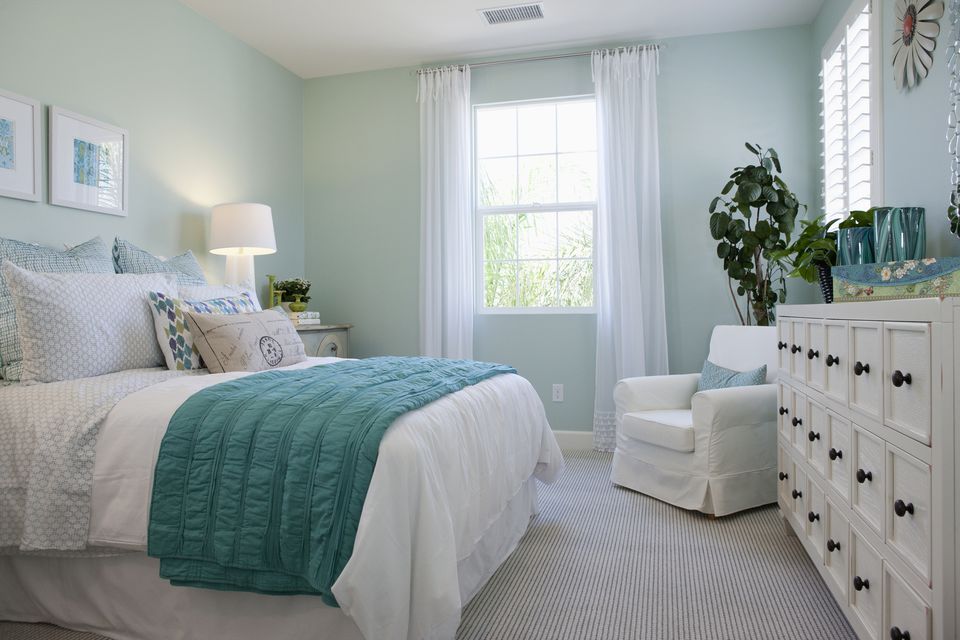
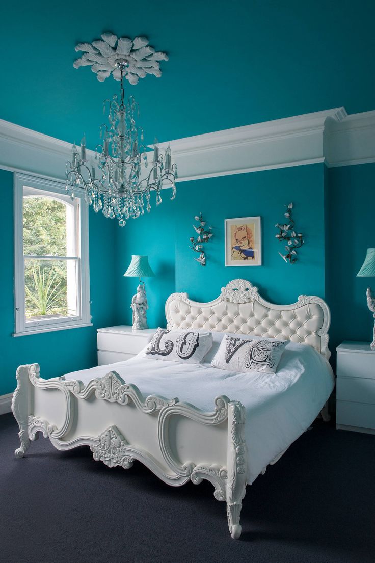
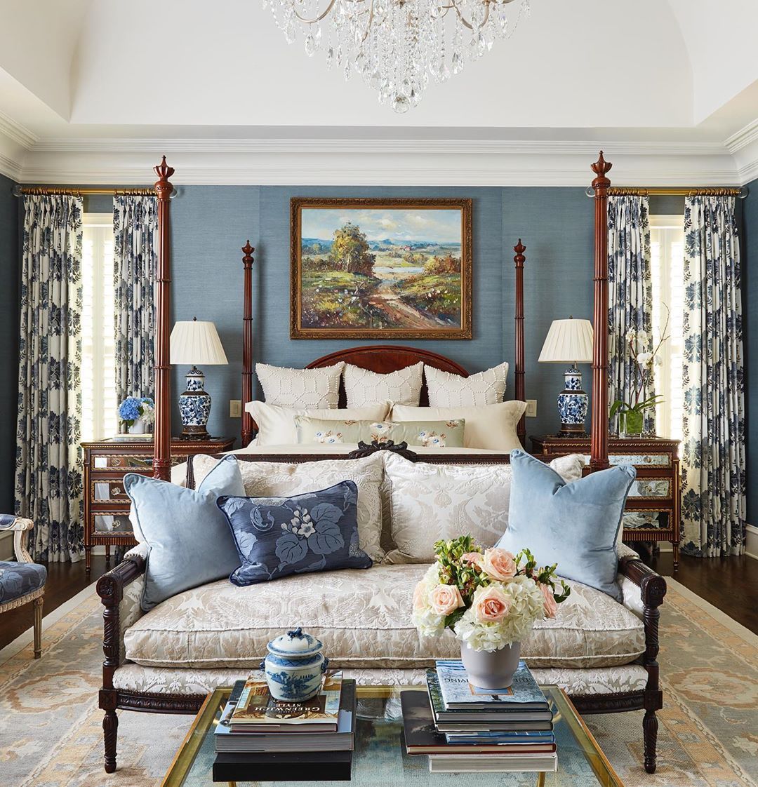
A. Blue: Universally calming, blue promotes deep, restful sleep. Choose navy or teal for drama, or sky blue for serenity.
B. Green: Symbolizing renewal and balance, green bedding brings nature’s tranquility indoors. Olive or sage work well with both modern and traditional decor.
C. Pink: From blush to fuchsia, pink can feel both soothing and joyful. Lighter pinks create a delicate ambiance; deeper shades add warmth.
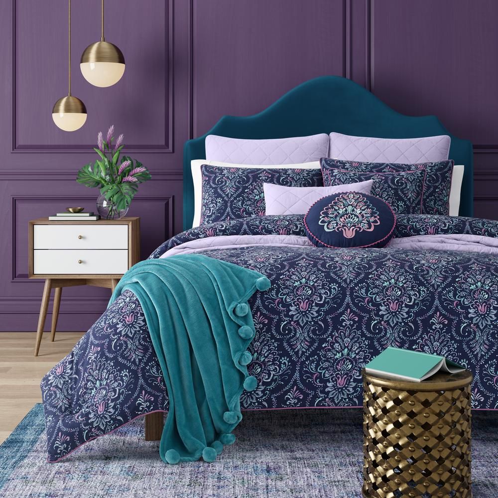
D. Purple: Lavender and mauve evoke romance and luxury, while rich plum adds sophisticated depth.
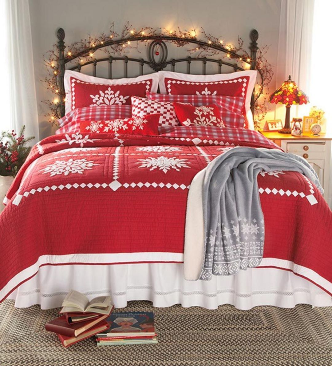
E. Red: A passionate color, red energizes a morning wake-up but can be too stimulating for some—use sparingly in layers or accents.
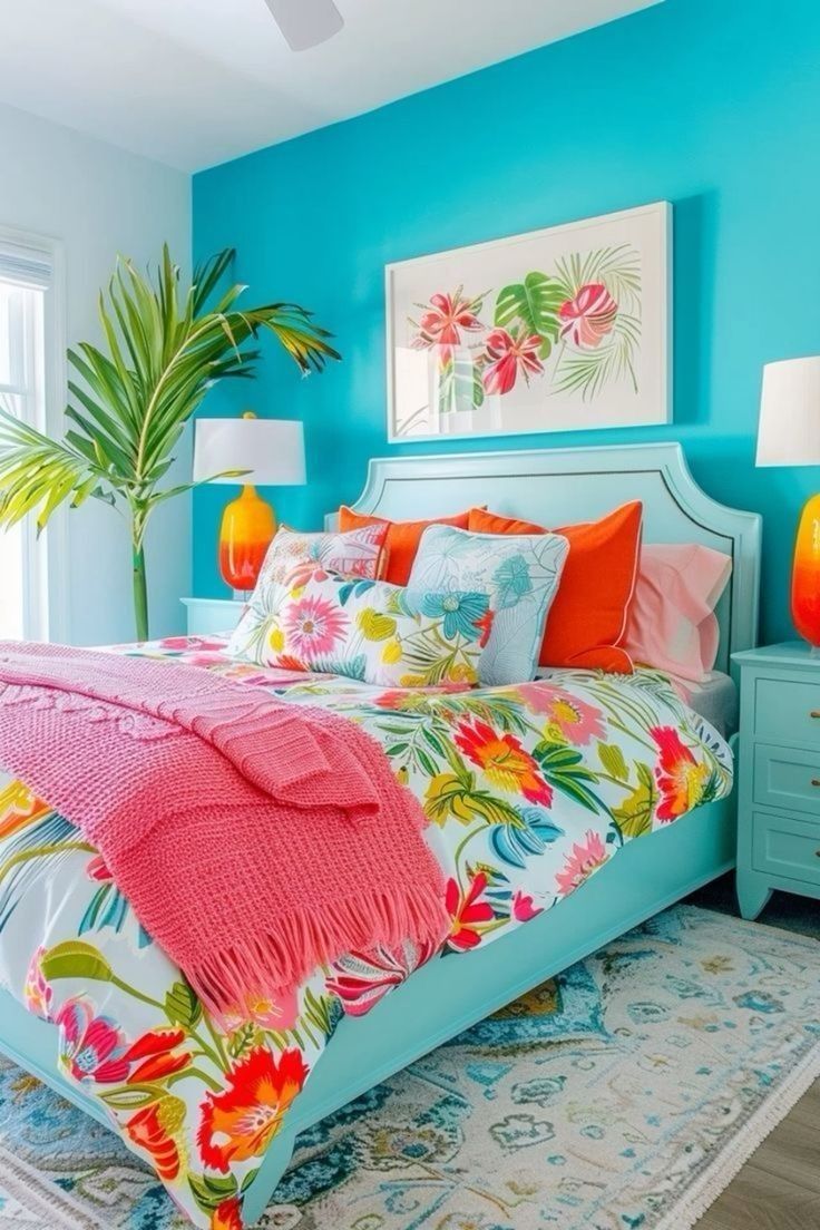
F. Yellow: Sunshine yellow or soft buttercream infuse cheer and positivity, ideal for dark bedrooms needing brightness.
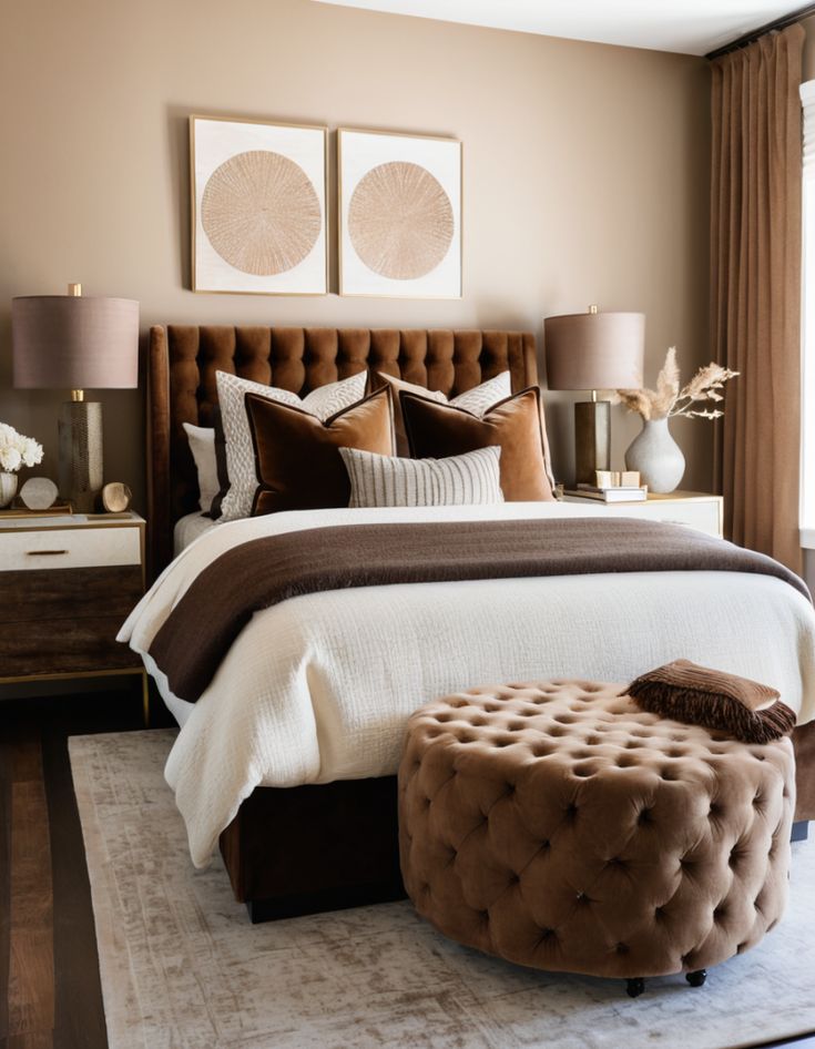
G. Orange: Warm and optimistic, burnt orange or terracotta offers cozy vibrancy—pair with neutral walls for balance.
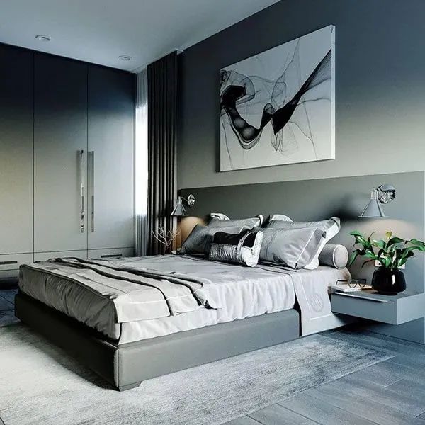
H. Neutrals with a Twist: Beige, taupe, and gray remain timeless but choose those with warm or cool undertones that fit your overall color scheme.
Layering Textures and Patterns
Colorful bedding goes beyond a single sheet or duvet; layering textures and patterns adds visual interest and depth. Follow these guidelines:
A. Base Layer (Solid Color): Start with a solid-color fitted sheet or duvet cover in your primary hue to anchor the palette.
B. Contrasting Layer (Pattern or Texture): Add patterned pillowcases, throws, or decorative pillows—stripes, florals, or geometric prints—to introduce contrast.
C. Accent Layer (Pop of Color): Finish with a bold accent pillow or quilt in a complementary shade to draw the eye.
D. Tactile Layer (Fabric Variety): Mix smooth cotton or linen with velvet, knit, or faux fur for a multisensory experience.
E. Balance: If patterns are busy, keep textiles in similar color families; for neutral textures, experiment with bolder prints.
Selecting Fabrics for Comfort and Style
The right fabric influences both the look and feel of your colorful bedding. Consider these options:
A. Cotton: Breathable, easy-care, and available in a vast color range—popular choices include Egyptian cotton for luxury and percale for crispness.
B. Linen: Perfectly imperfect texture and excellent moisture-wicking; dyed linen adds an organic, relaxed aesthetic.
C. Silk: Luxurious sheen and temperature-regulating, though higher maintenance; perfect for jewel-toned bedding.
D. Microfiber: Budget-friendly and colorfast, microfiber offers vibrant hues but can feel less breathable.
E. Bamboo Viscose: Eco‑friendly with a silky handfeel; often dyed in soft pastels and jewel tones.
F. Velvet: Adds depth and luxury; best used in throws or decorative pillows due to weight and care requirements.
Coordinating Bedding with Bedroom Decor
Vibrant bedding should harmonize with furniture, walls, and accessories. Use these tips:
A. Wall Colors: Choose bedding that complements or contrasts your wall paint—if walls are neutral, opt for bolder bedding; against a colorful wall, select a tone-on-tone set.
B. Furniture Finishes: Warm wood tones—walnut, oak—pair beautifully with teal, mustard, or burnt orange bedding. Cool metals—chrome, brushed nickel—highlight blues, grays, and purples.
C. Rugs and Curtains: Coordinate with bedding accent colors; for instance, a blush rug anchors pink bedding, while gray drapes temper bright yellows.
D. Accessories: Lampshades, artwork, and vases in complementary hues reinforce the palette. Use gold or brass accents to warm up cooler blue or green bedding.
E. Lighting: Adjust lighting (warm vs. cool bulbs) to enhance bedding colors—warm bulbs amplify reds and oranges, cool bulbs deepen blues and purples.
Practical Tips for Mixing Prints

Mixing prints can feel intimidating, but when done correctly, it creates an eclectic, collected look:
A. Scale Variation: Pair a large-scale pattern (e.g., oversized florals) with something smaller (e.g., pinstripes) to avoid visual overload.
B. Color Consistency: Ensure all prints share one or two common colors to tie the look together.
C. Number of Prints: Limit prints to two or three per bedding ensemble—beyond that, it can feel busy.
D. Neutral Breaks: Use solid-color sheets or a plain throw to give the eye a place to rest between patterns.
E. Pattern Families: Stick to patterns within the same family (geometric with geometric, floral with floral) or mix geometric with organic shapes for contrast.
Staying on Trend: 2024–2025 Bedding Colors
Interior design magazines and color authorities have identified key bedding hues for 2024–2025:
A. Sunset Terracotta: Warm, grounding, and versatile—pairs beautifully with cream and olive.
B. Deep Teal: Evokes sophistication; works well with gold accents and dark wood.
C. Dusty Rose: Soft yet modern; ideal for romantic and minimalist schemes alike.
D. Mustard Yellow: Adds a retro-chic vibe; looks stunning with gray or navy.
E. Emerald Green: Luxurious and energizing; complements marble and brass details.
F. Slate Blue: A soothing neutral alternative; layers well with charcoal and white.
Seasonal Bedding Switch‑Ups
Rotating bedding by season keeps the bedroom dynamic and aligned with comfort needs:
A. Spring: Light pastels (pistachio, blush) in breathable cotton or linen.
B. Summer: Bright brights (turquoise, lemon) in lightweight fabrics like bamboo or percale.
C. Autumn: Earthy tones (rust, olive) in mid‑weight linens or cotton blends.
D. Winter: Deep jewel tones (burgundy, forest green) in flannel, velvet, or sateen for warmth.
Maintenance and Care for Colorful Bedding
To keep vibrant bedding looking its best:
A. Pre‑Wash Colors: Wash new items separately to prevent dye bleeding onto lighter pieces.
B. Cold Water Wash: Preserves color intensity and fabric integrity.
C. Gentle Detergent: Use a mild, color‑safe formula—avoid bleach.
D. Low Heat or Air Dry: High heat can fade dyes; line‑drying maintains vibrancy.
E. Regular Rotation: Rotate sets every few months to distribute wear evenly.
F. Storage: Store off‑season bedding in breathable cotton bags to prevent mustiness.
Budget‑Friendly Bedding Upgrades

Refreshing your bedding need not break the bank. Consider these strategies:
A. Mix High & Low: Pair an investment-quality duvet cover with budget-friendly pillowcases.
B. Thrift Finds: Upcycle secondhand quilts or vintage coverlets—often they come in striking colors.
C. DIY Accents: Add colorful trim or piping to plain sheets for a custom look.
D. Layering: Use throws and shams you already own in bold colors before purchasing new main pieces.
E. Sale Alerts: Subscribe to home‑decor retailers’ newsletters for seasonal discounts on bedding.


